Hello friends! It’s Trending
Tuesday over at the Altered Pages Artsociates blog. Every month a different crafty trend is
highlighted and the whole team joins in the fun! We are teaming with Unruly PaperArts and
Leaky Shed Studio in April to bring you some fun projects with … MOOs.
A MOO is a small piece of art that can either stand alone or
be part of a larger project. The monthly
theme over at Unruly PaperArts is “Mail Art and MOOs” so I’ve incorporated mine
into a greeting card with (faux) postage today.

I found this wonderful cream colored paper from Art Papers
Online. Textured paper is a great way to
add some dimension and interest to a card project. Several layers of the three Colorbox chalk
inks shown were added to it. These are the only inks used throughout the project. I started
by simply rubbing the stamp pad over the ridges. Then I used sponges to add more layers. Finally, I dipped the edges in the dark brown
ink pad to give it a defined edge.

Because my theme for this card was “Paris” I chose to use
the rubber stamp set from Altered Pages’ sister company, The Mailbox Muse. These wonderful red rubber stamps were part
of the All Things French kit. The butterscotch
ink was sponged onto a sheet of cream card stock and then stamped with three
stamps - “evening in” “Paris” and the Eiffel Tower in the dark brown.

Two collage sheets of faux postage from Altered Pages were used for the images
on the MOOs. I was so excited to have a
reason to use my patterned scissors!
Using the postage stamp edged pair I cut out several of the more
colorful images that I thought would blend well with my color scheme. I brushed the edges with butterscotch ink to
highlight the fancy cut. Each MOO is 1 1/8” by 2 3/4” and two images fit
perfectly on each one. They were adhered with an Elmer's X-treme glue stick and then I trimmed the
excess and inked the edges. A wide band of burnt sienna went around each of the MOOs and then a thinner band of dark brown on top. After dipping each side into the brown ink pad, a Fleur de Lis brad was added to one on the corner to balance the flower attached to the
other side of the finished card.

I smooshed the Leaky Shed Studios crown down onto the dark
brown ink pad so that it would have an even coating of ink. Once it was glued onto the card three tiny
Prills by US ArtQuest were added to it over the laser engraved pattern.

Everything was adhered to the textured paper using Helmar
450 Quick Dry glue. I went with liquid
glue because the paper is extremely bumpy.
I wanted to be sure the images stuck well. I admit that I did weight the whole thing
down with a sheet of bubble wrap and a heavy book…just to be sure!

Be sure and come back on Friday for my next design team
post! Happy crafting!

Supplies:
Art Faux Postage collage sheet
Paris red rubber stamp set
Paris red rubber stamp set
Fiskars Postage pattern scissors
Brown flower – Michael’s dollar bin
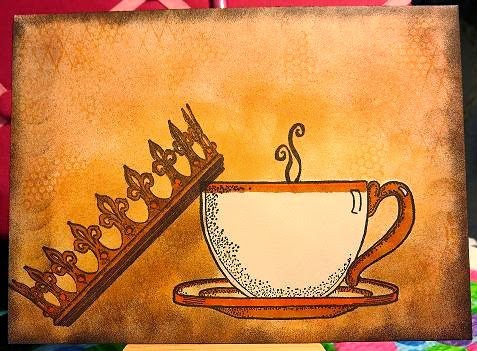
Tea Cup stamp from Auntie Amy
Crown stamp by Stampendous!
Steam stamp from Stampin' Up
Mini Circle texture stamp from Sin City Stamps
Diamond Grid stamp by Stamp Camp
Tea Cup stamp from Auntie Amy
Crown stamp by Stampendous!
Steam stamp from Stampin' Up
Mini Circle texture stamp from Sin City Stamps
Diamond Grid stamp by Stamp Camp
Oriental Trading Company Fleur de Lis brad
Colorbox Chalk ink – butterscotch, burnt sienna, dark brown


